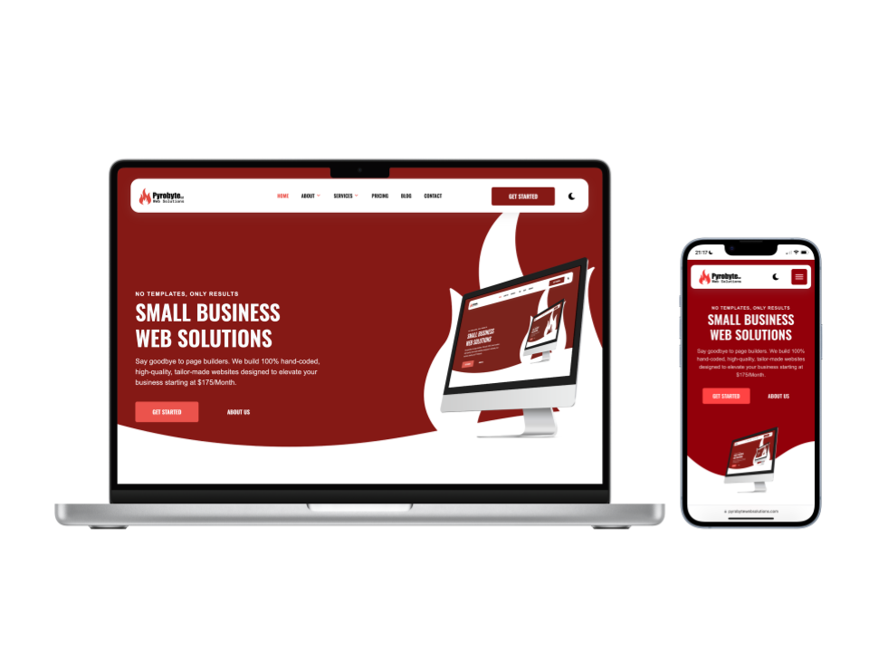
A Guide To Building Responsive Websites with a Mobile-First Approach
Understanding the Difference Between Mobile-First Development and Design
Mobile-first development and mobile-first design are often used interchangeably, but they are not the same thing. Designing a website with a mobile-first mindset means structuring layouts, content, and UI elements for smaller screens first, then expanding them for larger devices. This is often done by designing a desktop version first and then rearranging elements to fit smaller screens. While this approach can work for design, development requires a different strategy.
When coding a mobile-first website, the process starts at the smallest screen size and scales up. Instead of writing styles for a full-size desktop layout and then overriding them with media queries, mobile-first development ensures that the base styles are optimized for mobile, with additional styles added progressively for larger screens. This results in a more lightweight, efficient, and adaptable website.
The Advantage of Custom Code for Full Control
When it comes to mobile-first development, using custom code provides the highest level of flexibility and performance. Prebuilt themes and website builders often include unnecessary bloat, making it harder to achieve full responsiveness across all devices. Writing custom CSS, HTML, and JavaScript allows for complete control over breakpoints, layouts, and optimizations that match your exact design requirements.
For a deeper look into why custom code is the best option for full customization, check out this blog post where I break it down further.
Structuring Responsive CSS the Right Way
In a mobile-first approach, the default styles are written for mobile devices first, and media queries are used to scale up for larger screens. This ensures that mobile users receive the most optimized experience without loading unnecessary styles intended for larger devices. Here is the typical order I follow when writing CSS media queries:
/* Mobile - 360px */
@media only screen and (min-width: 0rem) {}

/* Tablet - 768px */
@media only screen and (min-width: 48rem) {}

/* Desktop - 1024px */
@media only screen and (min-width: 64rem) {}

/* Large Desktop - 1600px */
@media only screen and (min-width: 100rem) {}
Starting at 0rem ensures that the base styles are applied to all screen sizes by default. As the screen size increases, media queries introduce additional styling to enhance the layout without overriding previous styles unnecessarily. This keeps the code clean and scalable while maintaining an optimized experience for all users.
Testing and Debugging Responsive Designs
Throughout the development process, testing and debugging are crucial to ensuring that a website looks and functions properly on all screen sizes. Browser DevTools provide built-in responsive design modes that allow developers to visualize layouts at different breakpoints.
Using DevTools, you can simulate various screen sizes, inspect and modify styles in real time, and troubleshoot layout issues before they become problems. Consistently testing on both emulated and real devices ensures that your mobile-first approach holds up in real-world scenarios.


